About the Client
Our client is a leading investment management firm offering a comprehensive suite of services, including asset management, alternative funds, investment strategies, and financial advisory services.
As their operations grew, managing advisor relationships, onboarding processes, and accessing fund data became increasingly complex, necessitating a modern and user-friendly platform.
The Challenge
The client’s existing platform suffered from several usability issues that hindered advisor efficiency and overall user experience. These challenges, stemming from the increasing complexity of managing advisor relationships, onboarding processes, and accessing fund data, made a platform redesign essential.
- Fragmented Information Architecture: Critical data (client, relationship, and fund information) was scattered across multiple pages, forcing users to navigate excessively.
- Confusing Navigation: Unclear menu structures made it difficult for users to find the information they needed quickly.
- Inefficient User Flows: Adding relationships and managing advisor details was time-consuming and involved redundant steps.
- Overwhelming Onboarding Forms: Lengthy forms caused user fatigue, increasing errors and slowing down onboarding.
- Inconsistent Data Representation: A lack of standardization in data representation across dashboards and reports created confusion and hindered effective decision-making.
- Limited Access Points: Users struggled to access relevant documentation and relationship data from a single, unified location.
Project Goals
The redesign project aimed to address the identified challenges and achieve the following key objectives:
- Enhance User Experience: Create an intuitive and user-friendly platform with streamlined navigation and personalized dashboards.
- Simplify Workflows: Optimize relationship and fund management workflows to reduce complexity and improve efficiency.
- Centralize Data Visibility: Provide a single, unified view of all relevant data to facilitate quicker and more informed decision-making.
- Improve Onboarding: Streamline the onboarding journey for both advisors and clients, reducing friction and improving completion rates.
- Provide Actionable Insights: Deliver clear, standardized data presentations to provide actionable insights for better investment management.
- Ensure Continuous Improvement: Establish a dedicated UI/UX team to focus on ongoing improvements based on user feedback and design optimization.
Our Solution
We implemented a comprehensive UI/UX redesign strategy, a key success for our Design Services practice. Our approach, centered on user-centric design principles and continuous improvement, addressed all aspects of the platform’s user experience.
- Information Architecture Overhaul: We completely restructured the platform’s information architecture, streamlining content and data pathways for intuitive navigation. This involved creating clear hierarchies and logical groupings of information.
- Visual and Interaction Design Enhancements: We introduced a modern, visually appealing design with clear visual cues, responsive buttons, and intuitive menus, greatly improving the overall user experience.
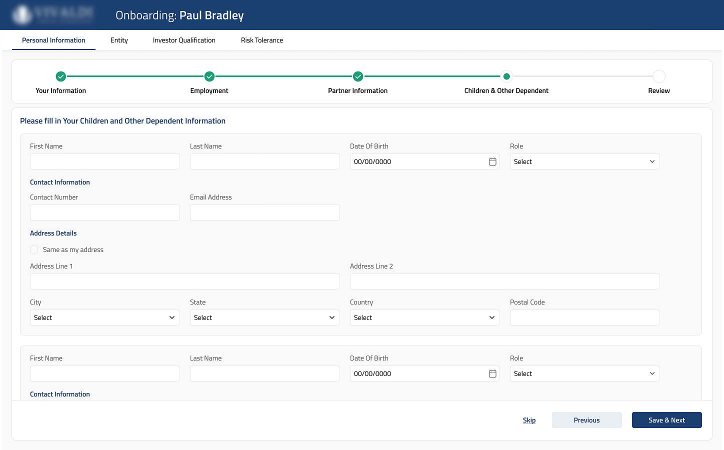
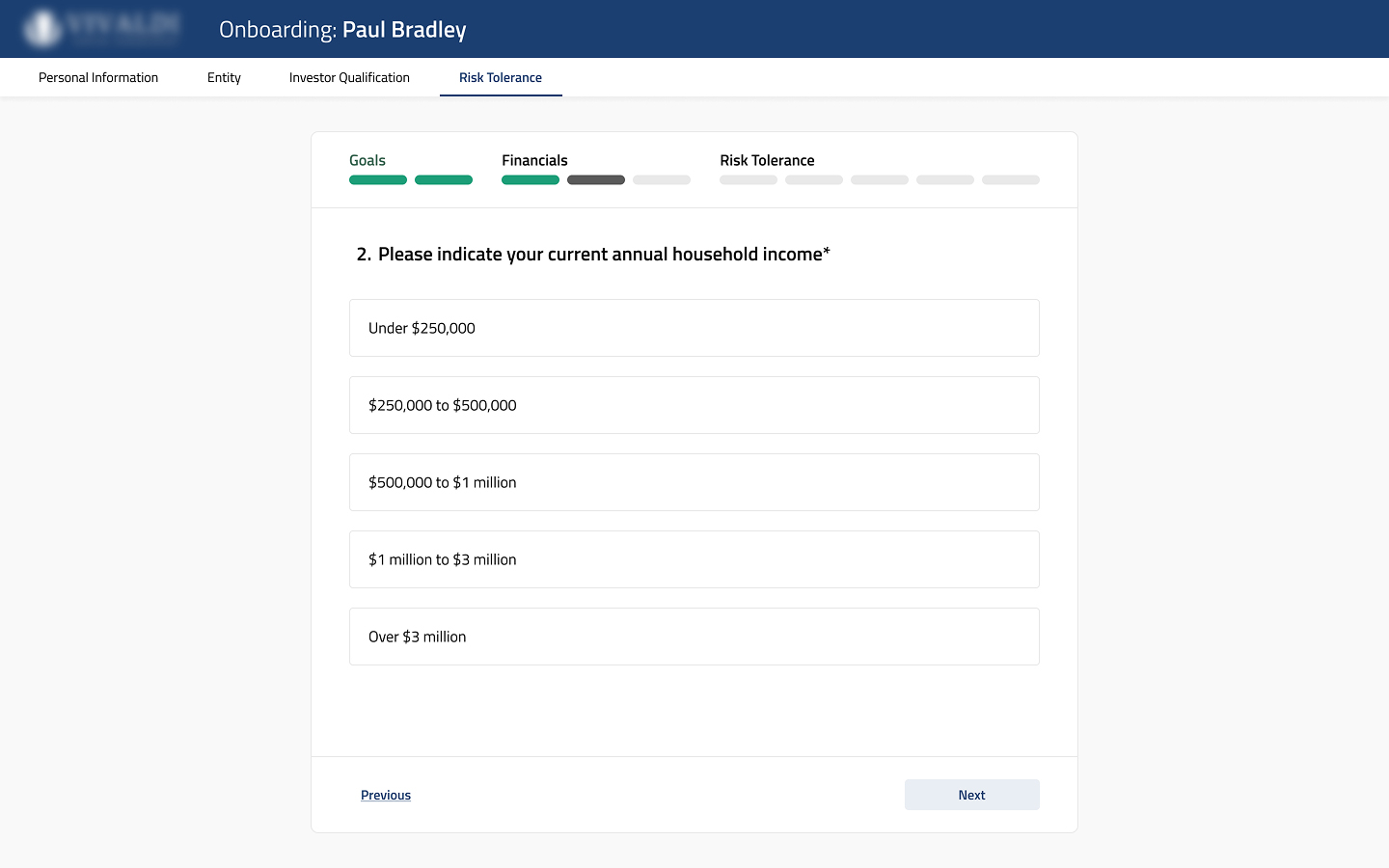
- Onboarding Process Simplification: We redesigned the lengthy onboarding forms, breaking them down into smaller, manageable steps with clear progress indicators. This significantly reduced cognitive load and improved completion rates.
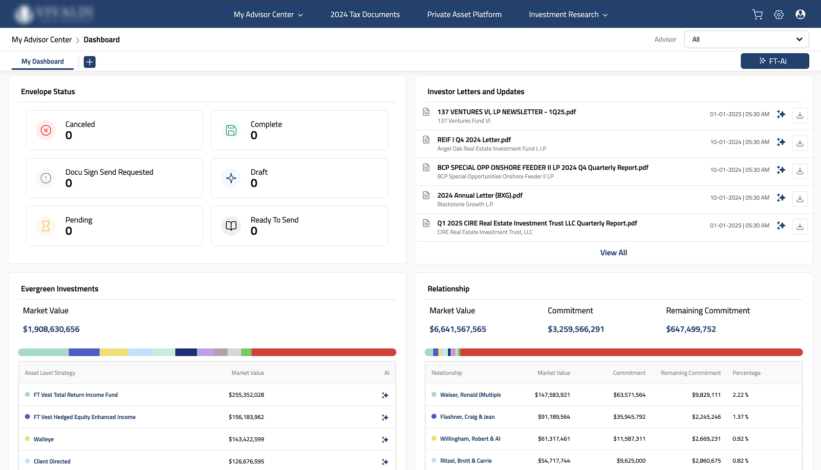
- Unified Data Management and Presentation: We consolidated fund and relationship data into centralized dashboards, providing users with a single source of truth for quicker access and better-informed decisions.
- Dedicated UI/UX Team for Continuous Improvement: A dedicated team was established to ensure ongoing design enhancements based on user feedback and evolving business needs, ensuring long-term platform success.
Key Implementations and Illustrative Examples
Below see how our redesign addressed key challenges, directly referencing the visual changes evident in the provided wireframes and design mockups.
- Centralized, Contextual Dashboards: The redesigned dashboards provide a comprehensive view of client relationships, asset allocations, and investment performance, all in one place. Users can quickly access key metrics and drill down into specific details without navigating through multiple screens. The use of clear visual hierarchies makes the information easy to understand and act upon.
- Streamlined, Step-by-Step Onboarding: The new onboarding process guides users through a series of logical steps, collecting information in manageable chunks. Progress indicators and clear labeling reduce user anxiety and improve completion rates. The design incorporates user-friendly input fields and validation to minimize errors.
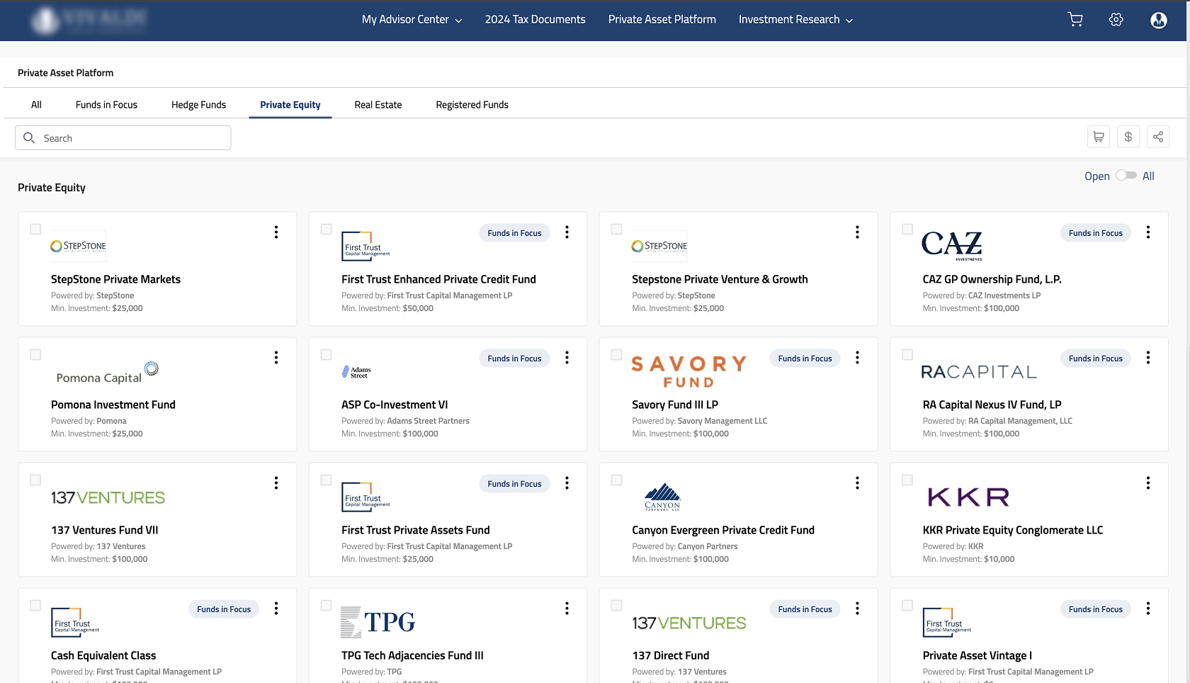
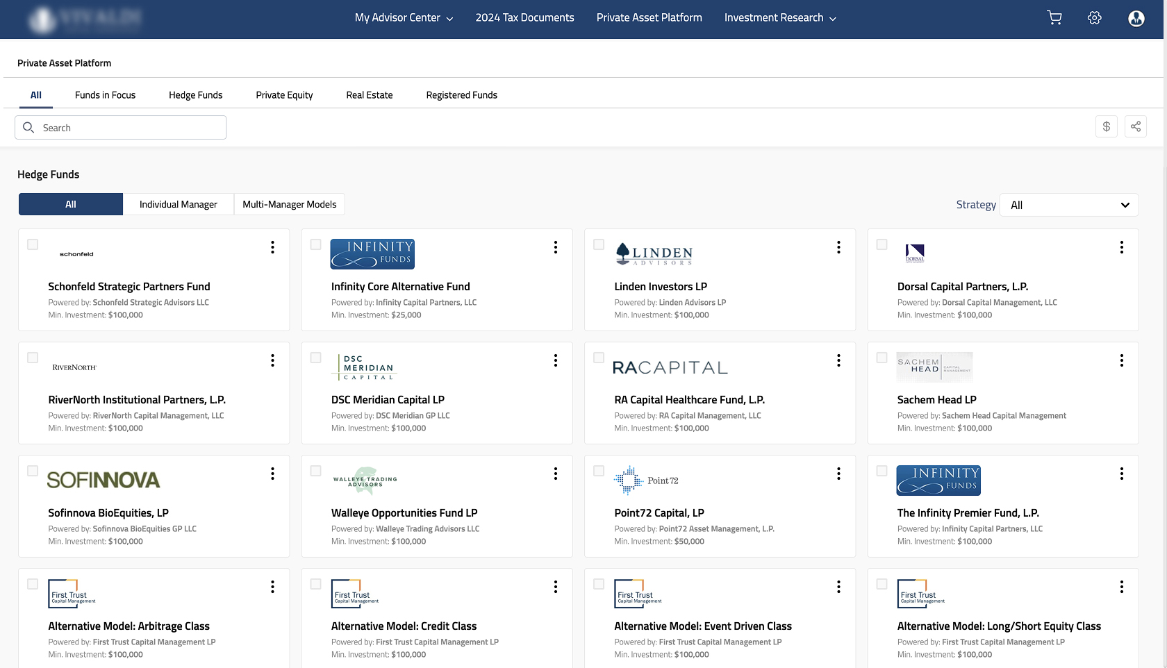
- Tabbed Navigation for Efficient Fund Exploration: Implemented tab-based navigation for fund categories (Private Equity, Hedge Funds, Real Estate), allowing users to quickly access and explore relevant investment options.
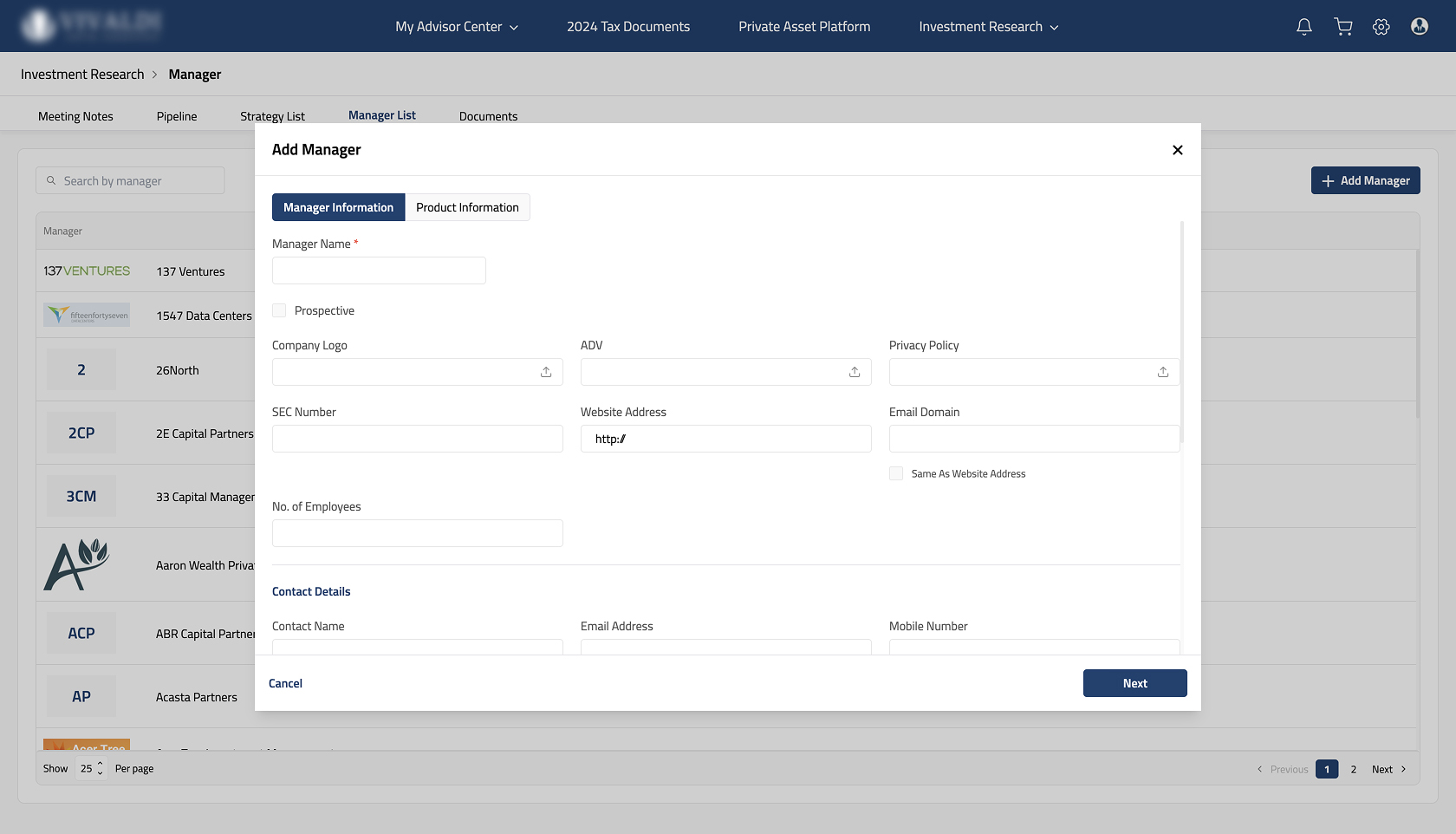
- Unified Fund Manager Onboarding: Introduced a streamlined process for fund manager onboarding, providing a consolidated view of performance data and strategies.
The Results
The UI/UX redesign delivered significant, measurable improvements for the investment management firm.
- Streamlined Administrative Workflows: Centralized data management and intuitive navigation significantly reduced the time required for administrative tasks.
- Increased User Engagement: The personalized dashboards and user-friendly interface led to higher user engagement and platform adoption.
- Reduced Onboarding Time: The simplified, step-based onboarding process dramatically reduced the time required to onboard new advisors and clients.
- Improved Decision-Making: Clear, standardized fund data presentation empowered advisors to make better-informed investment decisions.
- Ongoing Platform Evolution: The dedicated UI/UX team ensures continuous improvement and adaptation to evolving business needs.
Customer Satisfaction
The client awarded CoreFlex a 5/5 CSAT score, demonstrating their confidence in our UI/UX design strategy and execution.

Looking Ahead
We are committed to a long-term partnership with the client, continuously refining the platform and exploring further enhancements to optimize user experience and operational efficiency. This includes ongoing user research, A/B testing, and the implementation of new features based on evolving business requirements.
Let’s Talk
At CoreFlex, we don’t just redesign interfaces—we create user-centered experiences that drive business results. Whether you’re looking to streamline operations, improve user engagement, or enhance decision-making, our expertise in UI/UX design and development can help you achieve your goals.
Want to transform your user experience?
Let’s discuss how we can help your business achieve greater efficiency, higher user satisfaction, and improved business outcomes. Learn more about our Design Services here.