Introduction
In the digital age, data is universal. It’s true power lies in the ability to interpret and act on it effectively. This is where data visualization and user experience (UX) design intersect—transforming raw information into actionable insights through intuitive and engaging visual representations. As the saying goes, “Data is the new oil, but it’s only valuable when refined.” This blog explores how UX principles enhance data visualization, fostering better decision-making and user engagement.
The Significance of Data Visualization
Data visualization is the practice of representing data graphically through charts, graphs, maps, and infographics. Its importance stems from several key factors:
1. Enhancing Cognitive Processing
Studies have shown that the human brain processes visuals 60,000 times faster than text. This cognitive advantage means that data presented in a visual format is easier to comprehend, reducing the time required for analysis and decision-making. Visual representation of data allows individuals to identify patterns, correlations, and trends that might otherwise be difficult to discern from raw numerical values.
2. Simplifying Complexity
Data, especially in large datasets, can be overwhelming when presented in its raw form. Effective visualization techniques, such as heatmaps or trend lines, distill complex patterns into digestible insights. For example, a heatmap tracking website engagement can instantly highlight areas of high user activity, which would otherwise require extensive numerical analysis. Visualization helps bridge the gap between complexity and comprehension, enabling users to make informed choices without being data scientists.
3. Facilitating Data-Driven Decision-Making
Organizations rely on key performance indicators (KPIs) to measure success. Visual dashboards enable stakeholders to track real-time data, identify trends, and make informed strategic decisions. For instance, a sales manager analysing customer purchasing behaviour through an interactive dashboard can make data-backed inventory adjustments. By integrating well-designed visual representations into business intelligence platforms, companies ensure that decision-makers at every level can easily interpret and respond to critical data trends. At CoreFlex, we’ve seen how embedding these principles into enterprise dashboards dramatically increases stakeholder alignment and responsiveness.
4. Strengthening Storytelling with Data
Data visualization is not just about presenting numbers—it’s about telling a story. A compelling visualization presents data in a way that conveys a clear narrative, providing context, comparisons, and insights that inform and persuade. A well-crafted visualization can evoke emotions and drive action, making it a powerful tool in business, journalism, healthcare, and many other fields.
The Role of UX in Data Visualization
Data visualization is not just about creating charts—it’s about crafting experiences that allow users to derive insights efficiently. UX principles ensure that visualizations are not only informative but also intuitive and engaging. UX plays a fundamental role in making data visualization more impactful by ensuring usability, clarity, and accessibility.
1. Simplifying Data Interpretation
Good UX design minimizes cognitive load by organizing data hierarchically and eliminating unnecessary complexity. This involves:
- Using color coding effectively to distinguish between data sets.
- Implementing progressive disclosure, where users see high-level insights first and can drill down for details.
- Avoiding chart junk—unnecessary embellishments that obscure key takeaways.
- Grouping related information together to create logical structures for better comprehension.
2. Enhancing Accessibility
Inclusive design is fundamental in UX. Ensuring data visualizations are accessible to users with visual or cognitive impairments enhances usability for a broader audience. This can be achieved through:
- Providing alternative text for graphs.
- Using high-contrast color palettes for individuals with color blindness.
- Incorporating keyboard navigation and screen-reader compatibility.
- Supporting multiple interaction methods, such as voice commands and gesture controls.
3. Encouraging Data Exploration
Interactive visualizations empower users to explore data dynamically. Features such as hover-over tooltips, drill-down capabilities, and filtering options allow users to personalize their data exploration journey, uncovering insights that static visuals might miss. For example, a financial analyst using an interactive visualization tool can manipulate variables to observe potential investment outcomes under different market conditions.
4. Strengthening Retention and Engagement
A well-designed visualization tells a compelling story. UX principles such as storytelling structures (e.g., beginning with an overview and progressively adding details) make data more memorable. For example, a time-series animation of global temperature changes can have a far more profound impact than a static bar chart. When data is presented in a way that resonates with users, they are more likely to engage with and act upon the information.
5. Real-Time Data Interpretation
For industries we serve at CoreFlex—such as healthcare, logistics, and finance, real time data visualization and UX-led dashboards have become a non-negotiable part of operational excellence.
For instance, in the medical field, real-time monitoring of patient vitals using well-designed dashboards can aid healthcare professionals in making life-saving decisions. UX principles ensure that such dashboards prioritize crucial data, minimize distractions, and provide intuitive interfaces for quick comprehension.
Principles of Effective Data Visualization
To create impactful and user-friendly data visualizations, designers should adhere to the following principles:
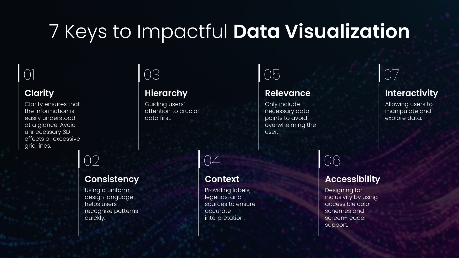
1. Clarity
Clarity ensures that the information is easily understood at a glance. Avoid unnecessary 3D effects or excessive grid lines.
Example: A line chart showing company revenue over five years should focus only on relevant data points without unnecessary embellishments.
2. Consistency
Using a uniform design language helps users recognize patterns quickly.
Example: A financial dashboard should consistently use green for revenue and red for expenses.
3. Hierarchy
Guiding users’ attention to crucial data first.
Example: A sales dashboard should display total revenue in a bold, prominent font, while secondary metrics can be smaller.
4. Context
Providing labels, legends, and sources to ensure accurate interpretation.
Example: A bar chart comparing sales should clearly state the currency (e.g., USD) and time period.
5. Relevance
Only include necessary data points to avoid overwhelming the user.
Example: A product performance report should highlight top-selling items instead of listing all items.
6. Accessibility
Designing for inclusivity by using accessible color schemes and screen-reader support.
Example: A pie chart should avoid using red-green color combinations, as they are difficult for colorblind users to distinguish.
7. Interactivity
Allowing users to manipulate and explore data.
Example: A sales report should have filters to view revenue by different regions or time periods.
Resources for Continuous Learning
To hone your skills, consider these resources:
Books:
- The Functional Art by Alberto Cairo.
- Storytelling with Data by Cole Nussbaumer Knaflic.
Websites:
Takeaways
Data visualization, when integrated with UX principles, transforms raw data into compelling, user-friendly narratives. By focusing on clarity, accessibility, and engagement, designers can ensure that data is not just seen—but truly understood and acted upon. As businesses and individuals continue to rely on data for decision-making, the fusion of UX and data visualization will remain pivotal in bridging insights with impactful action.
Embrace the power of data visualization and UX, and create visuals that inform, inspire, and drive meaningful change.
As businesses and individuals continue to rely on data for decision-making, the fusion of UX and data visualization will remain pivotal in bridging insights with impactful action.
At CoreFlex, our UX and Data teams help enterprises turn complex data into intuitive, decision-ready visuals—tailored to your goals, your users, and your industry.
Let’s Elevate Your Data Experience
Need help transforming your dashboards or visual analytics into truly user-centric experiences? Whether you’re looking to redesign clunky internal tools, build intuitive customer-facing reports, or enhance data accessibility across your organization—CoreFlex can help. Our Design Practice blends UX expertise with deep technical know-how to turn complex datasets into clear, actionable, and engaging insights.
When you’re ready to elevate your data experience and drive better business outcomes, CoreFlex is ready to lead the way. Contact us today to get started.